Year: 2019
Company: Advantage F.S.E
Type: UX, UI, Branding
Platforms: iOS, Android, Web
Timeframe: 1 month
I was responsible for the conceptualization and implementation of the proposal, as well as the evaluation and incorporation of the user research data into the designs. For confidentiality reasons, the name of the bank is omitted.
The challenge
The main goal of the project was to establish a strong digital presence for the bank in the Romanian market. The bank's strategy promoted a bold character in regards to their branding while aiming for a mobile-first approach. Moreover, they were aiming to increase significantly their user base and bring to market meaningful innovations. With regards to the proposal, we decided to focus on specific user journeys to illustrate the bank's requirements:
1. Customer onboarding for first-time users
2. Dashboard and account details.
2. Dashboard and account details.
My role
I worked alongside a remote UX researcher who was responsible for running the initial user research on the Romanian market, a Business Strategist and the Product Manager of the app. As a designer of the proposal, I had to consult the company's development team to make sure that the already implemented out-of-the-box product solution is respected at a functional level, and the go-live date is not jeopardized.
Our process
We approached the challenge by discovering and establishing the business needs and technical constraints. The next step was to research and uncover user needs in the Romanian market, with the intent to analyze the data and proceed to the definition of the user flows. To finalize the user flows, we run ideation workshops with the team and visualized them in wireframes. The visual design came after, which started with a small branding exercise. I had to study the bank's brand and establish a color palette and typographic scale that would form my foundations to move on into the final designs. After the completion of the designs, we run 20 usability-testing sessions (focus groups) to examine and test our assumptions. Given that the whole project was held in one month period, we tried to take into account as many data as possible. In the end, we were confident enough to present our proposal to the client.
Discover the market
We conducted an online questionnaire with a diverse sample of 60 Romanians, to understand their digital banking lives.
82%
of the users are using the ATM from Moderately to Very often
48%
of the users are using a specific bank, because that’s where their employee pays them
48%
of the users wants the ability to pay a bill directly through their phone’s camera
29%
of the users wants the ability to chat online with a banking agent
For confidentiality reasons I have omitted the actual values for these metrics.
Usability testing
We selected 20 individuals (Android and iOS users) from the company premises, that have limited to no interaction with the product and we asked them to complete 6 tasks:
1. Find the nearest ATM/Branch
2. Read the total balance of all your accounts
3. Transfer money between accounts you own
4. Setup alert, when you get paid
5. Communicate with the Bank
6. Logout from the App
The results showed us that all tasks, apart from the “Floating Button” action, reach a success rate of above 70%. The "Floating Button” was mostly undiscoverable by users of both platforms. Yet, the results for the floating button were inconclusive as we discovered that the lack of interactivity of the mockup affected the results.
Design rationale
We decided to work on two different designs for Android and iOS platforms to demonstrate two different look-and-feels, with platform-specific controls and actions. For example in the Android flavor, we used a burger icon for the menu and a floating action button for quick payments, whereas in iOS we used a bottom navigation menu bar with the quick action being emphasized in the center. Moreover, for Android, the design feels more sharp and absolute, while in the other design we used a more soft, roundy approach. The branding guidelines guide us to believe that the sharp, bold character is the one that could fit most with the bank's character but we wanted to experiment broader at that stage of design.
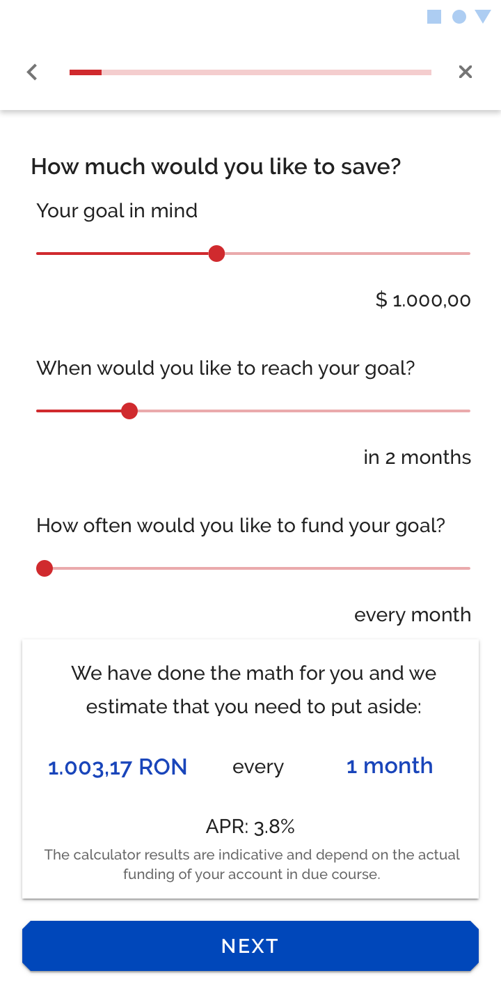
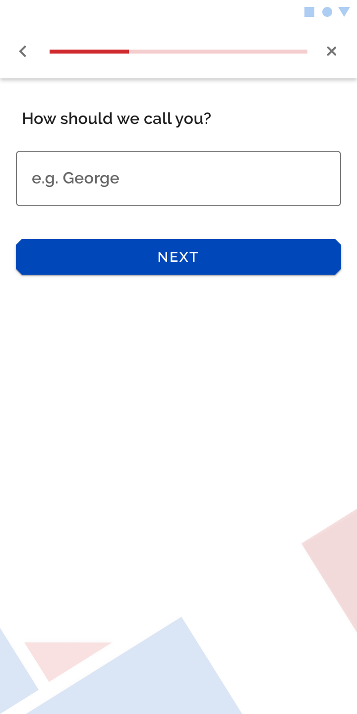
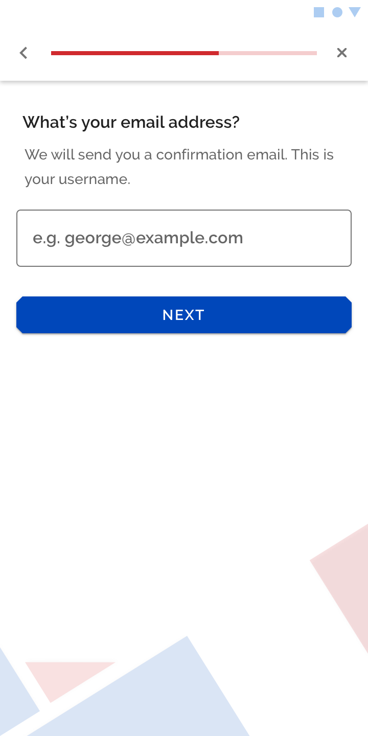
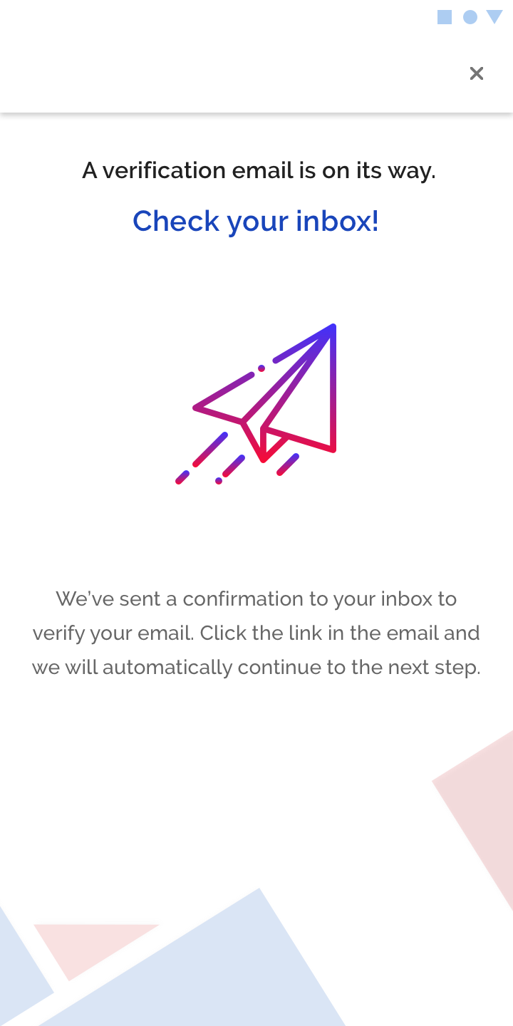
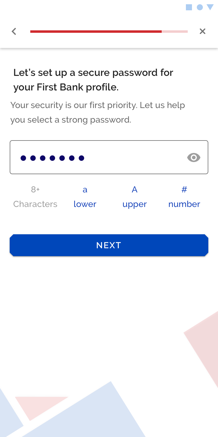
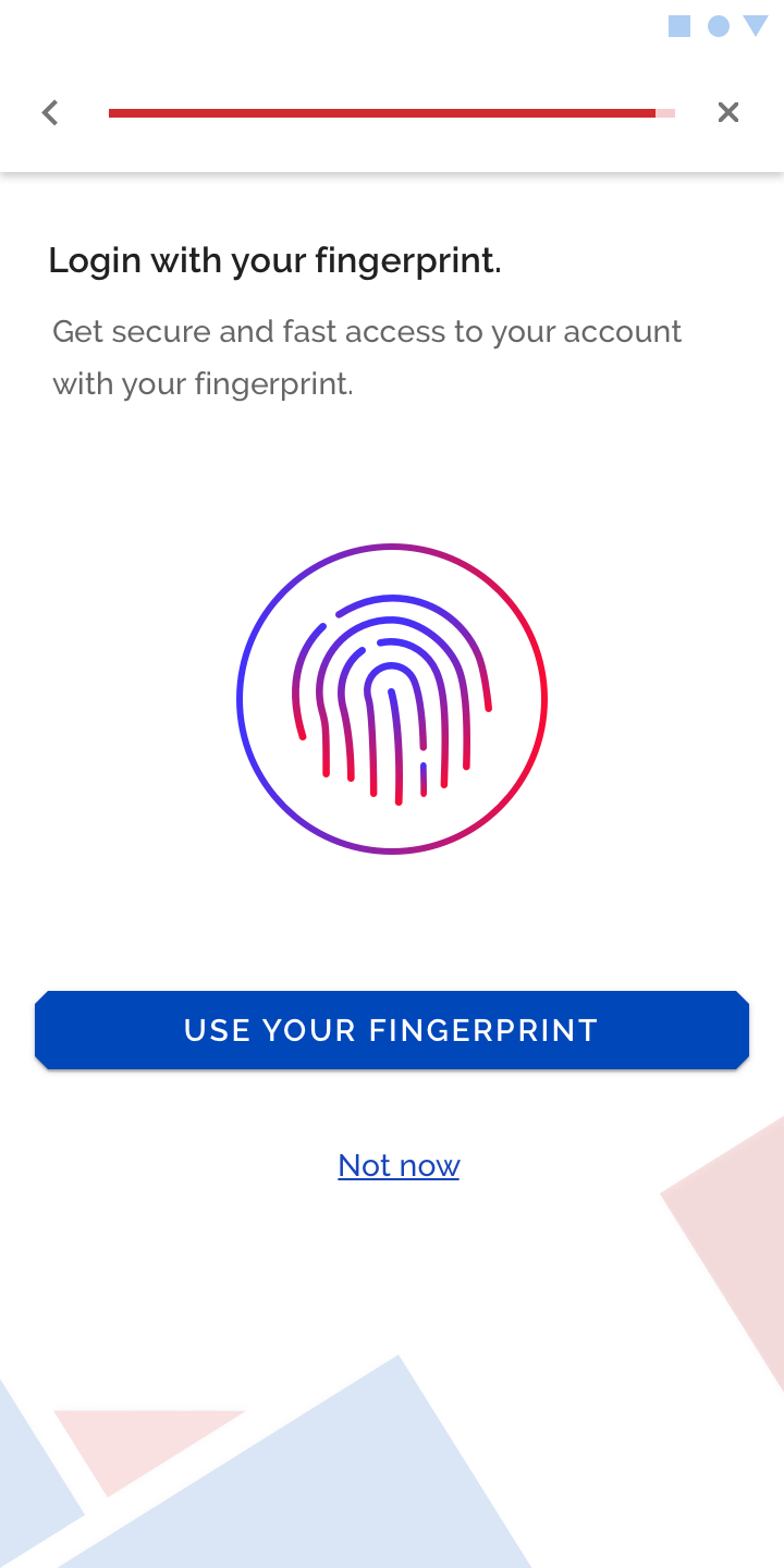
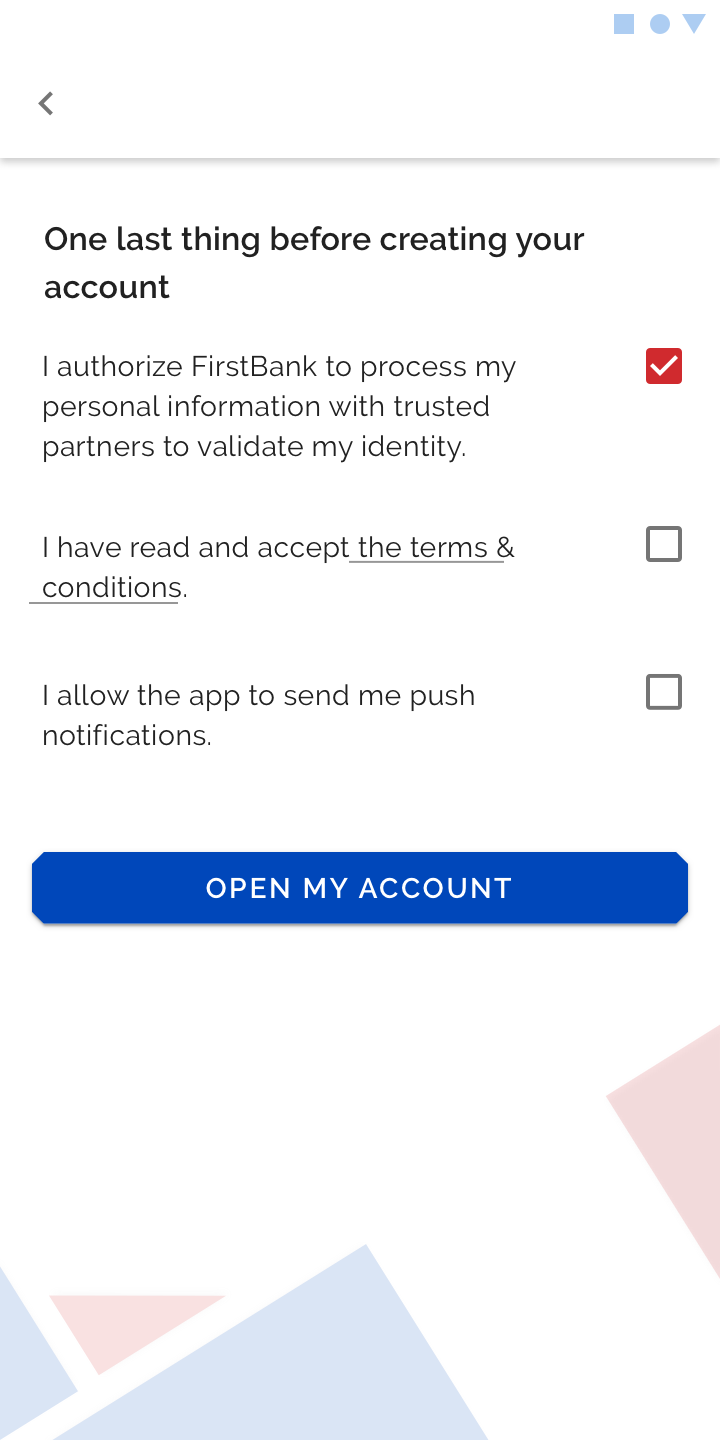
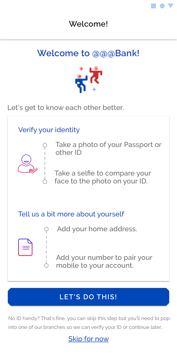
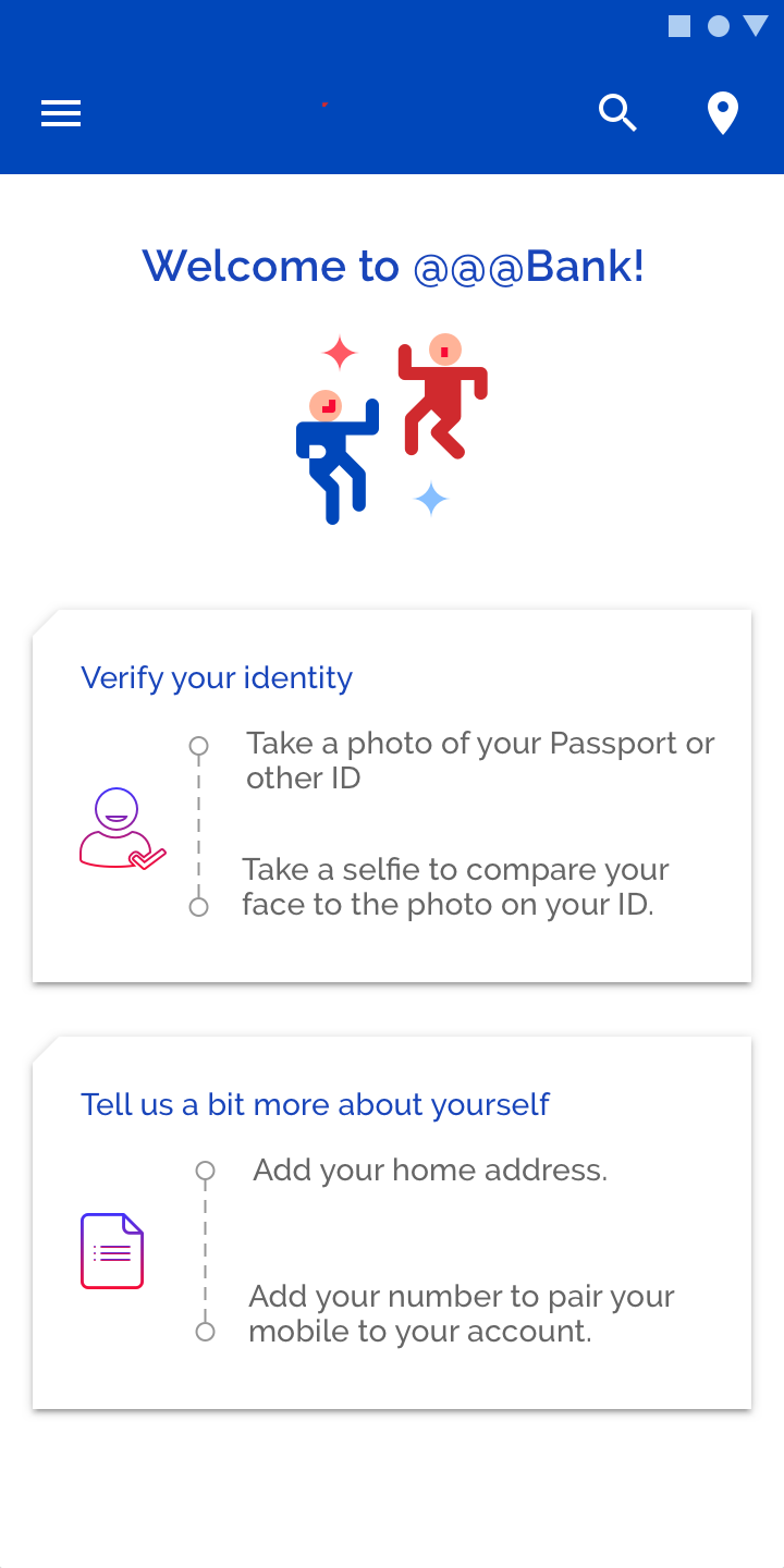
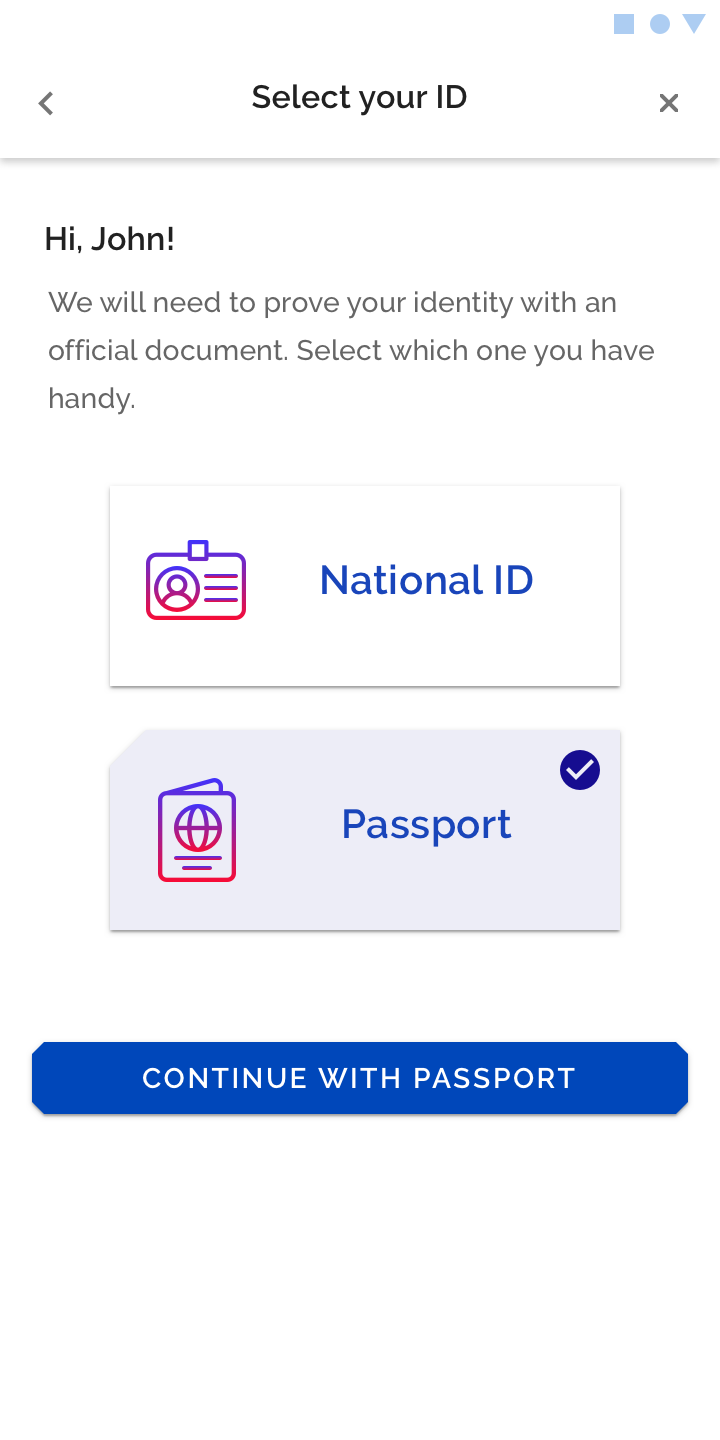
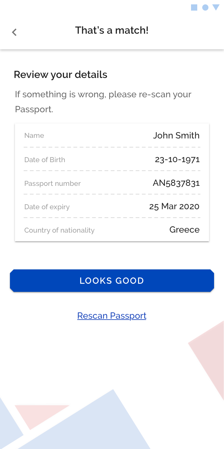
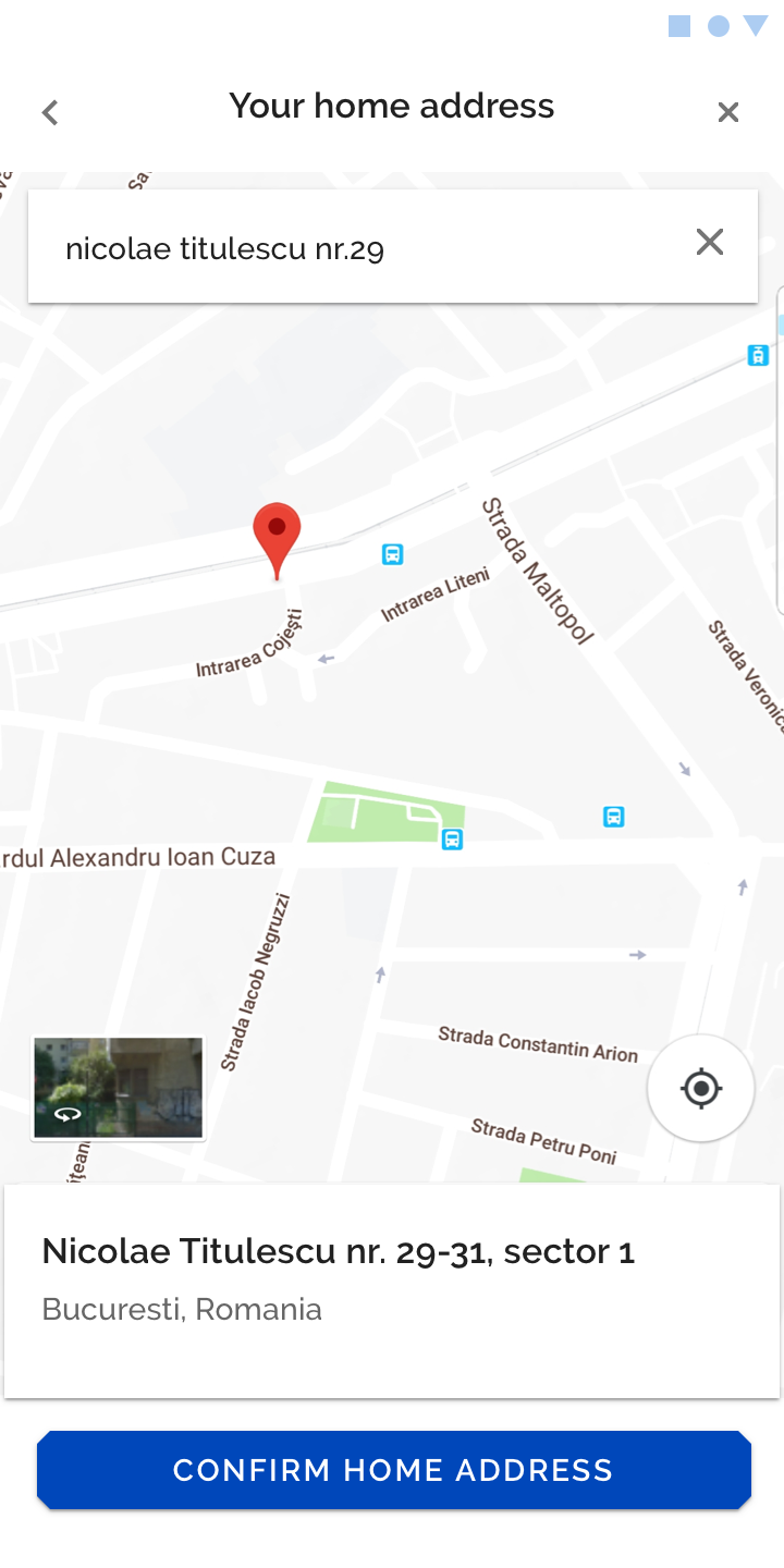
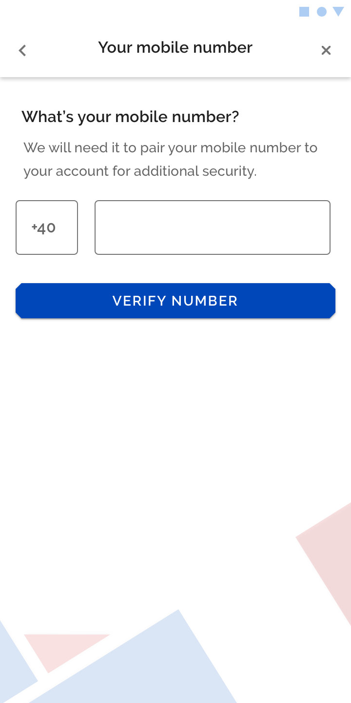
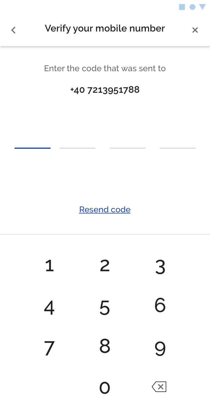
With regards to the onboarding flow, we designed a soft KYC flow, where the customer is being asked to give a name and e-mail to log in and create an account. After that, she is being asked to verify her identity following known KYC steps, where it is required to scan an ID or passport, take a selfie, give a home address and verify her mobile number.
Branding material
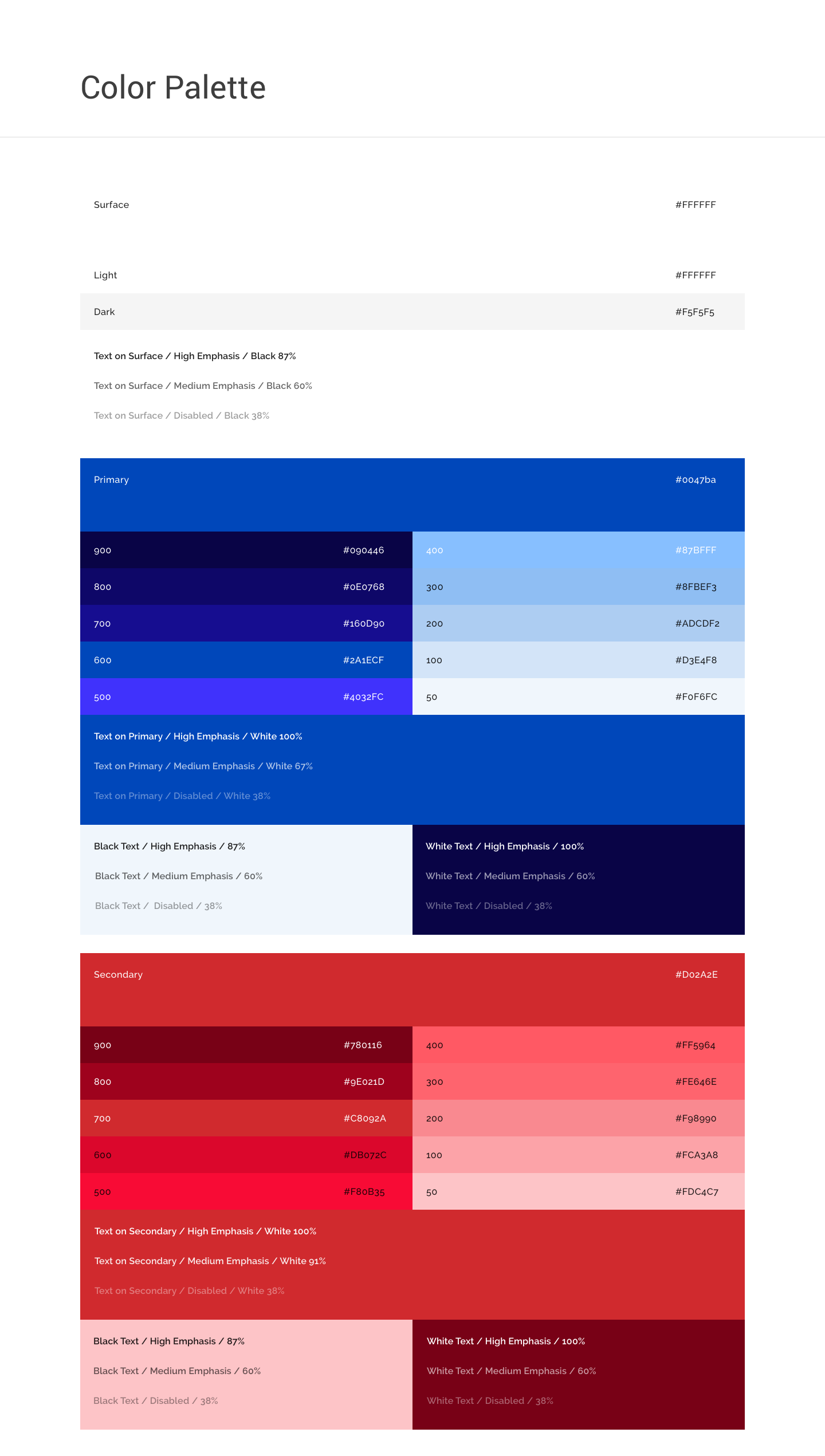
color palette
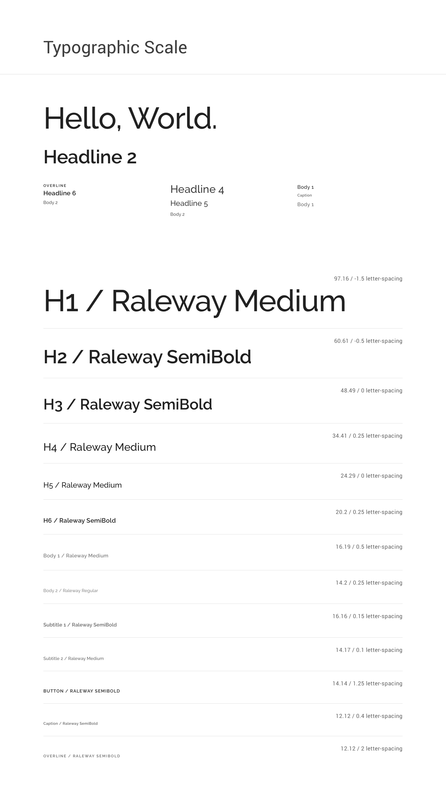
typographic scale
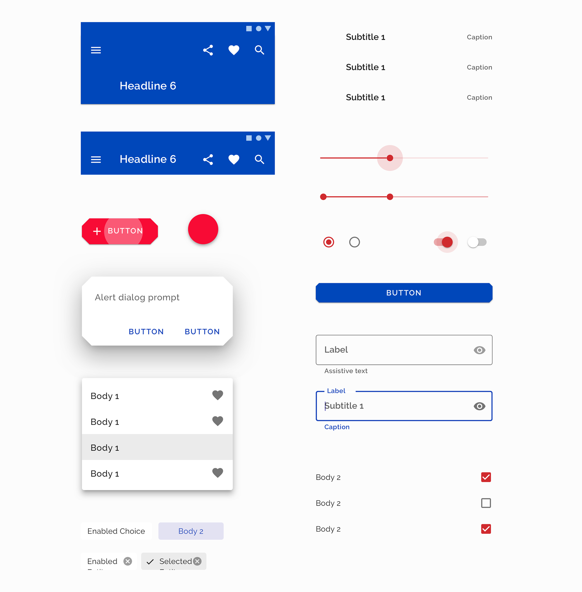
Soft KYC onboarding flow
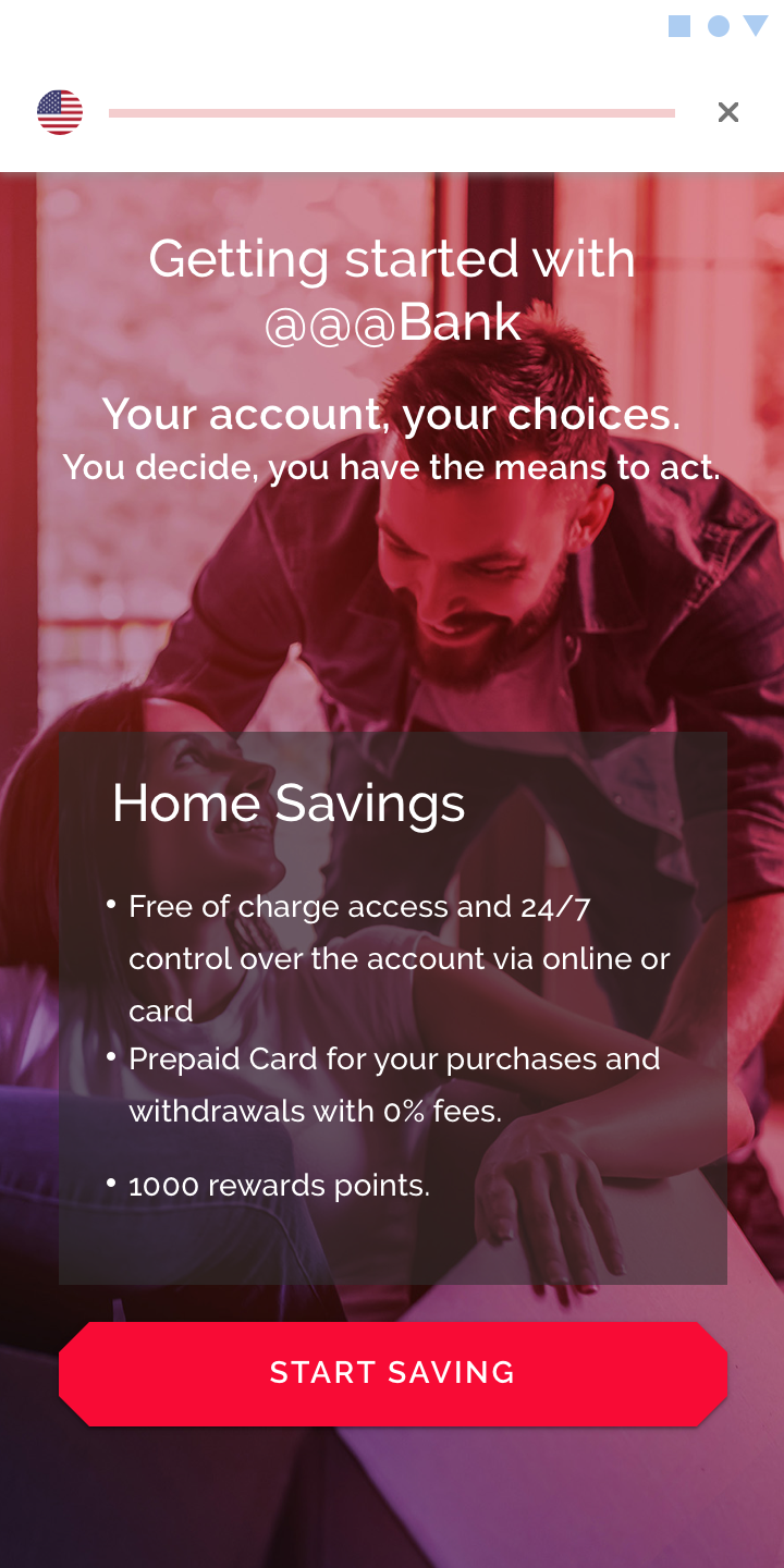
The App