Year: 2019
Company: Advantage F.S.E
Type : UX, UI, Interaction
Platforms: iOS, Android, Web
Timeframe: 4 months
I was part of a demanding project to redesign the payment flow of a digital banking product solution, that is currently being used by over 10 different banks in Latin-America, Europe, and Australia.
Design for bankers
When this product was first designed and launched to the Romanian market, it was conceptualized by business people and meant to be liked and sold to business people. User research, analysis, and feedback were out of scope and the result was a product that brought each and every core bank process on the surface, using difficult-to-understand terminology, and struggling to scale alongside the human-centric needs of the market. Users felt frustrated, unable to understand what they should do, what options to choose and where to find what they are looking for, in the context of making a payment. Fundamental usability was challenged.
The challenge
The goal of the project was simple: to simplify the payment process for all users. That meant that we had to consider 3 different continents, 10 different countries, anglo-Saxo countries with specific eccentricities and different needs, and all this in a tight timeline. Plus, we wanted to alienate as less as possible the user when he/she migrates to our new solution. In other words, we wanted to embrace a diverse user base and create a payment flow that makes perfect sense to everyone, everywhere.
Our high-level goals were to:
1. Jargon-free our terminology and micro-copy.
2. Make processes mobile-friendly, especially those that add value to the user.
3. Accommodate the need for repetitive payment actions and make them accessible to the user.
The scope of the project was narrow and focused around the payments section only. Therefore, one major constraint for us was to make sure that the new design and flow has to feel part of the same ecosystem.
My role
This project was captured in 4 months and I was one of the two designers in the team, with the other one being a senior designer. I worked autonomously and I was responsible for the android platform. We worked alongside a Business Analyst, a Business Strategist, and a Product Manager.
My colleague and I were responsible for fleshing out the company requirements and translating them into user needs. Of course, as mentioned already, the timeline was strict and we could only take insights from a small part of our user base. For the rest, we took some educated assumptions and tried to cover them afterward with usability testing. Even so, we had to define and prioritize our type of audience, discuss and ideate for approaches, prototype, test, and iterate.

Early insights
The project started with feedback received from an Australian bank and its user base. They shared that their users need to consider too many decisions before making a transaction, and choose amongst a set of options which cannot completely understand. Moreover, they found recurring actions, such as the ability to repeat a payment, too complicated and fragmented. The system at that point didn’t provide the option to create a new beneficiary via mobile, thus this was creating a major pain point. There was no intuitive way to reuse payment details other than setting them up as templates, which were not easy to locate. Plus, it was unclear to the user the distinction between templates and beneficiaries which led us to think, early on, if we even need both. Turns out we did not.
"users need to consider too many decisions before making a transaction, and choose amongst a set of options which cannot completely understand."
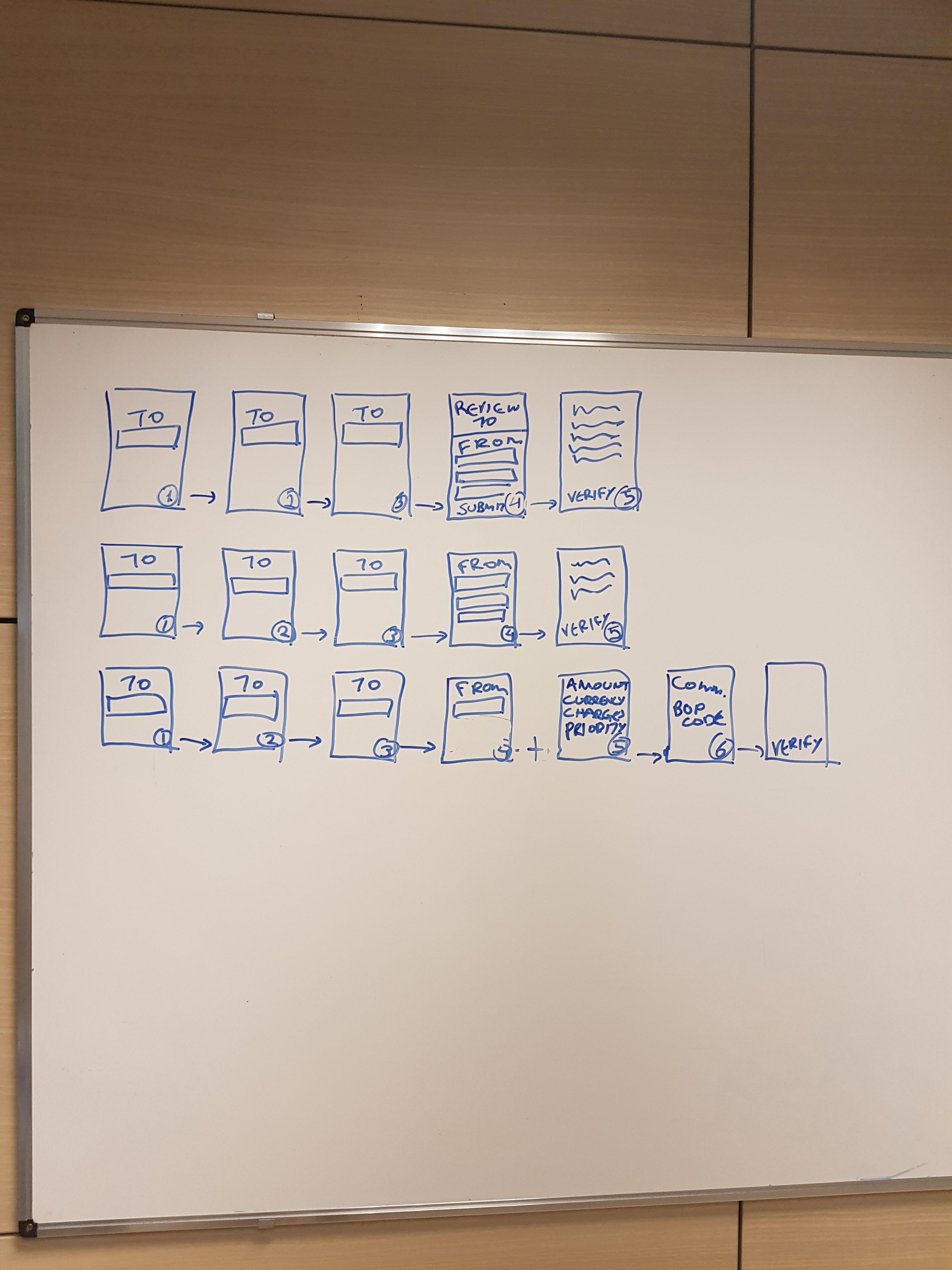
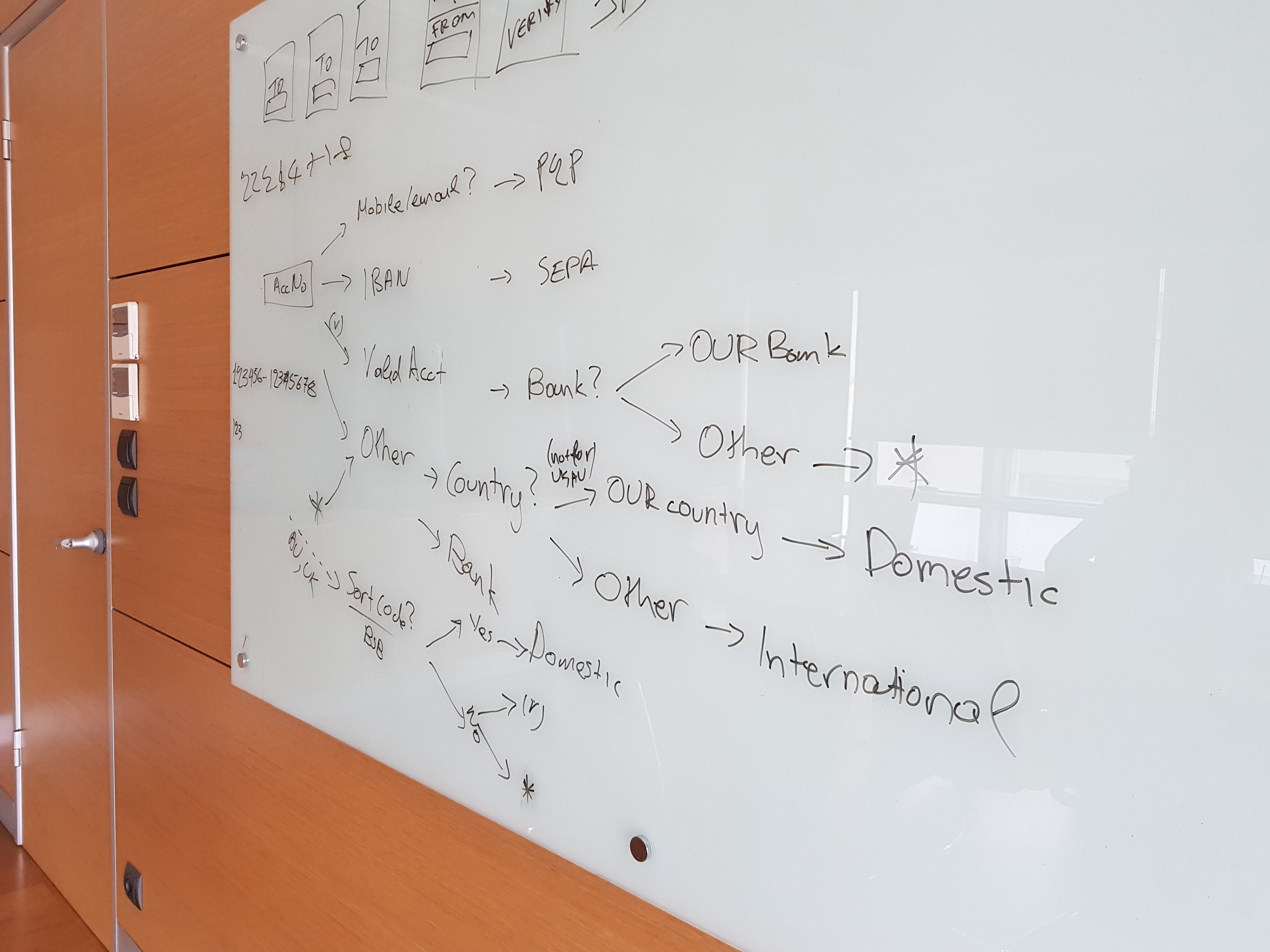
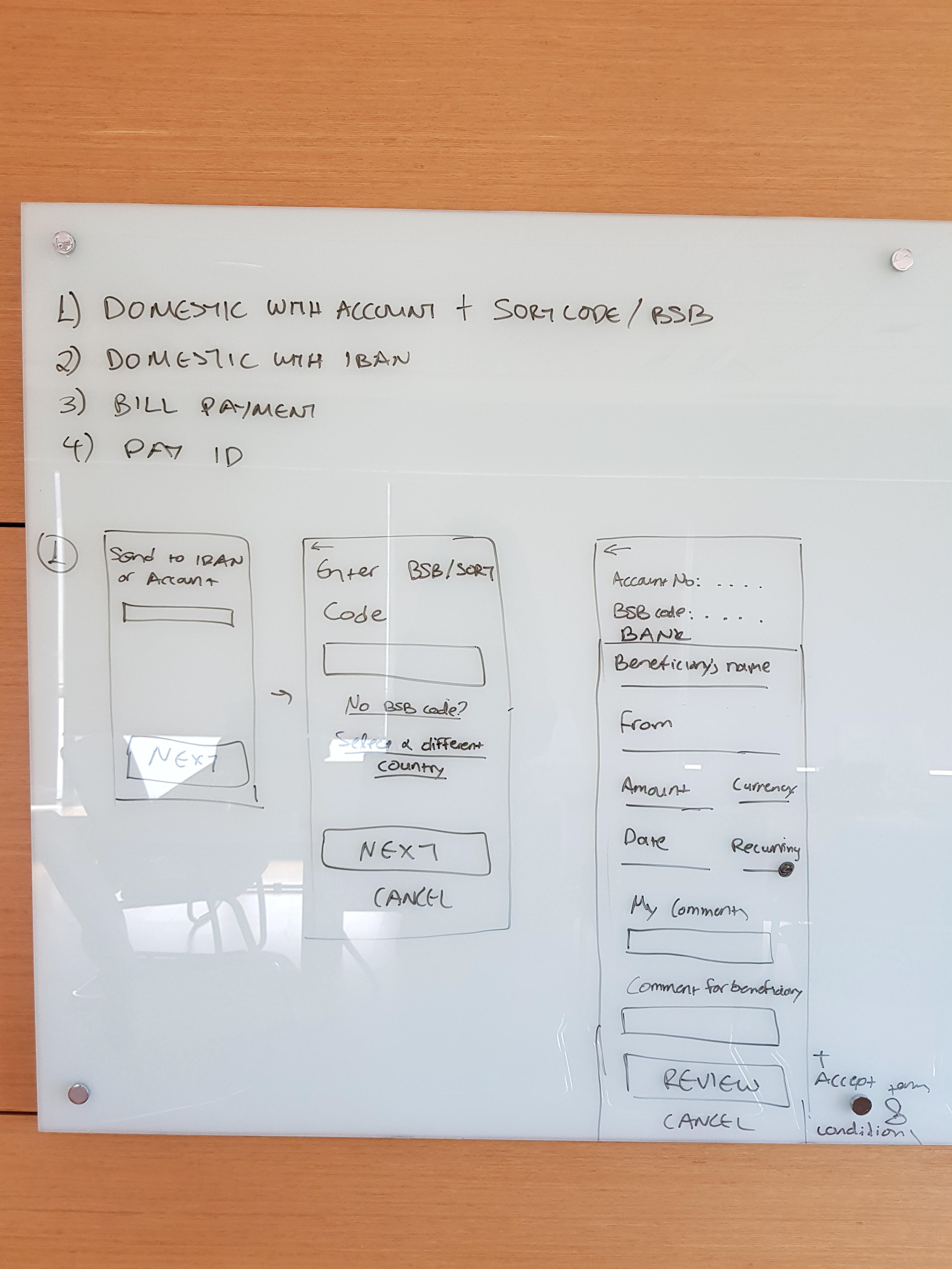
Splitting the payment flow - payment wizard
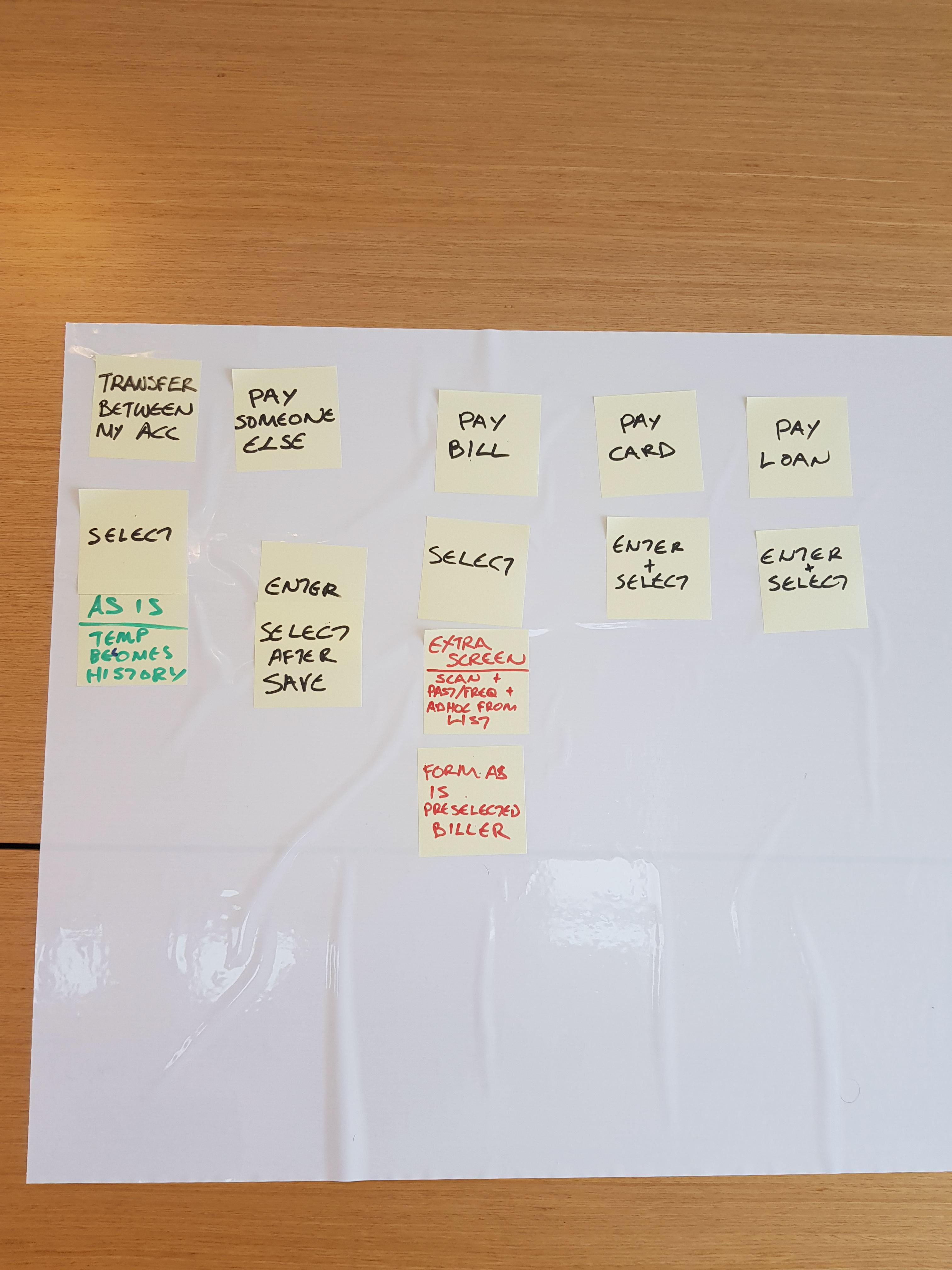
With these requirements and pain points at hand, we started digging into what are the main routes of the problem(s). We decided to focus on the payment flow per se. We examined how many options we give to the user for her to make a payment and what each one exactly means. Our main objective was to get rid of jargon language and prevent the user from having to decide between a set of options, such as intrabank, domestic or international payment, to continue: all she knows is that she needs to pay someone else or transfer money. These choices are system-related problems and should be handled and resolved by the system.
We decided to approach payments using a payment wizard. The idea was that the user will have to decide whether she needs to transfer money or pay someone else (later on these options were expanded) and then input the appropriate information. As the user enters the information, the system computes the appropriate path for that type of payment and routes the user accordingly. The wizard thus has a branching logic behind the scenes, but the perceived user experience is that of a linear flow: one screen after another, and all the user has to do is to click “next.” (Or “back” or “cancel”)
By showing less information at a time, we aimed to allow users to focus better on the payment content and decrease decision fatigue or any chance of errors. Our approach was to ensure that people will be asked to input data only applicable to their situation.
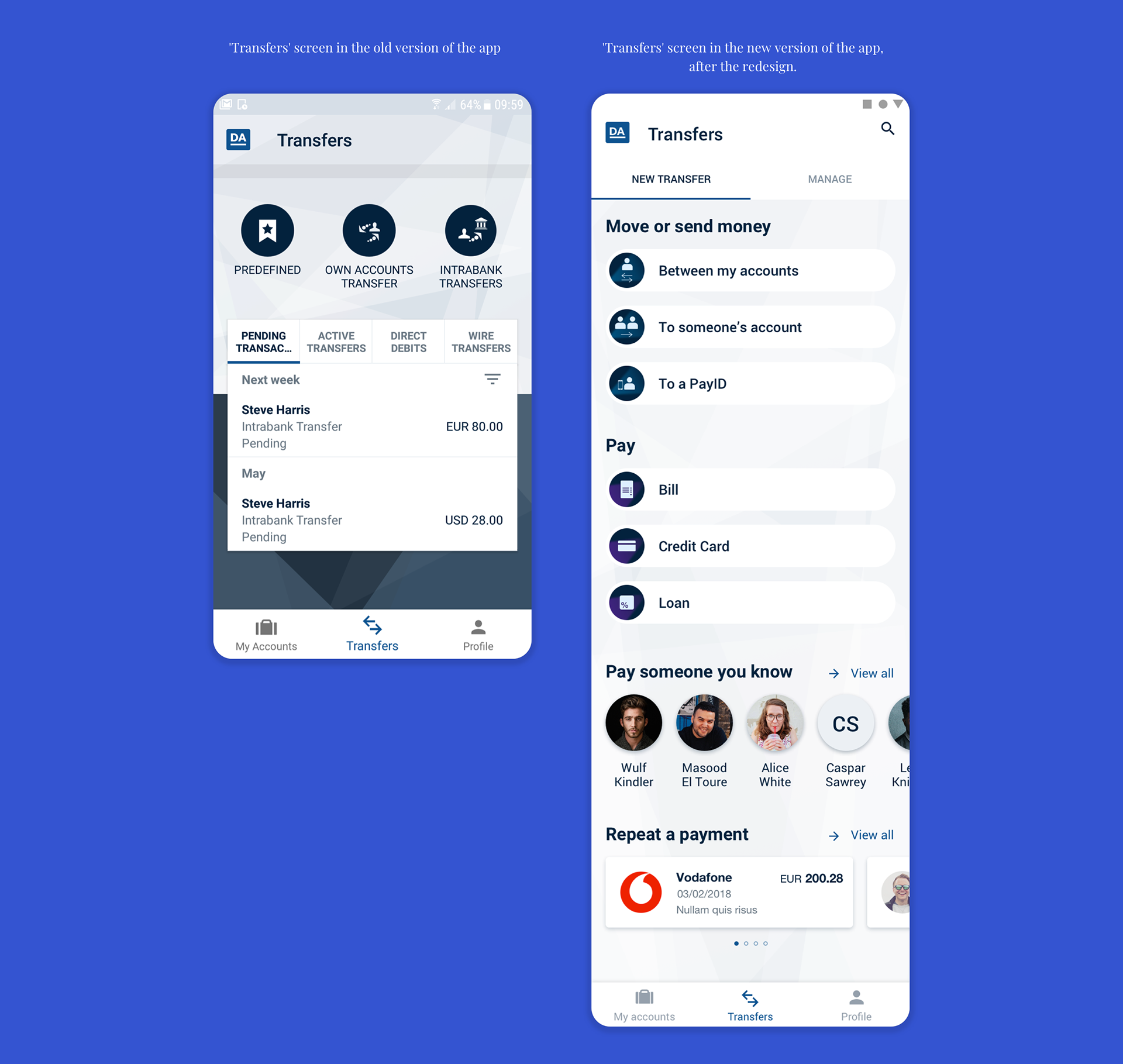
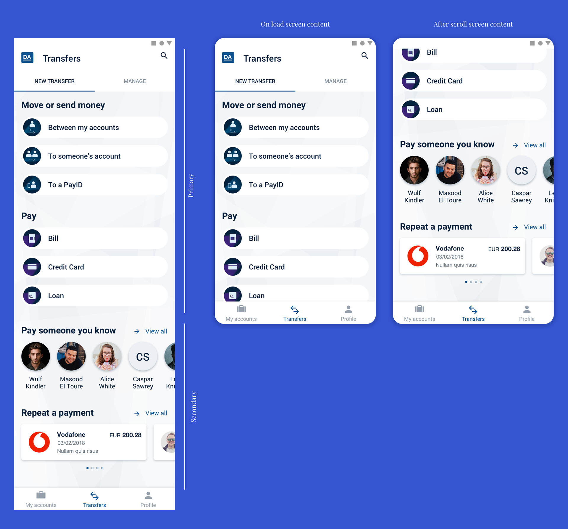
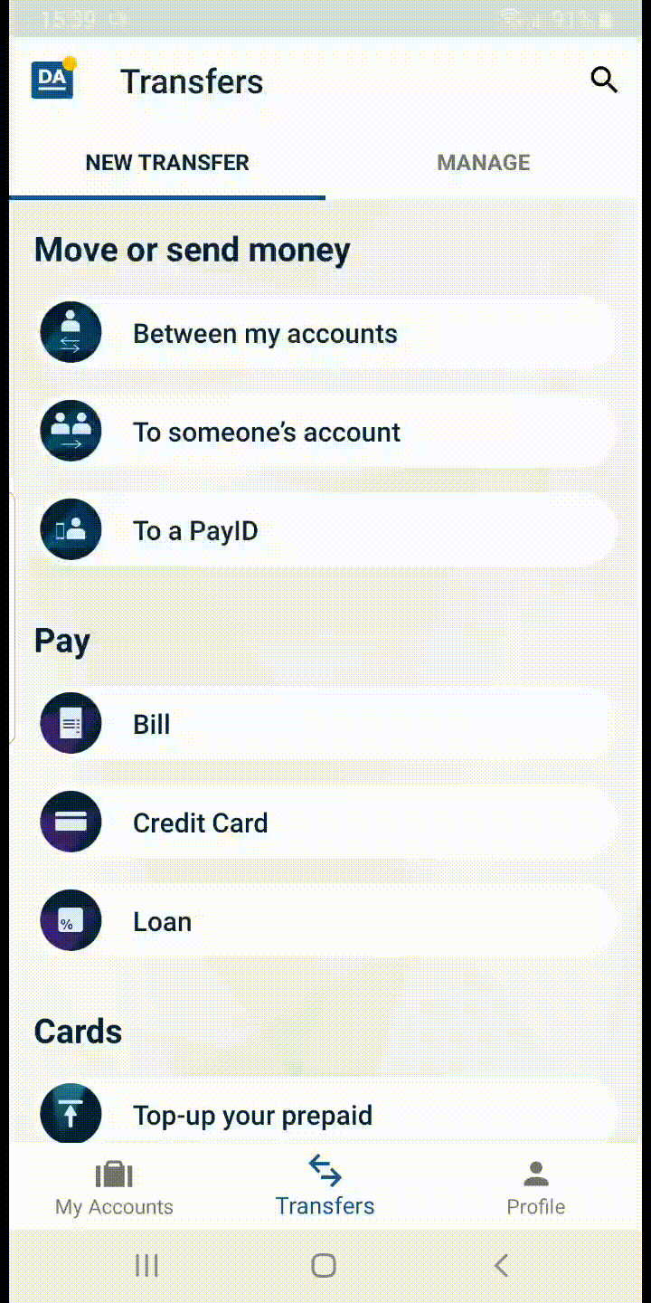
Payments section
Payments could be initiated through a ‘New transfer’ section or, as we used to call it, a payment hub. The content of the screen has been structured into two areas, immediately visible content and off-screen content, accommodating two different types of audiences: first-time users, and users already familiar with the app and comfortable using shortcuts for completing intended actions.
The two sections are not mutually exclusive - any user can perform their intended action through the first section (visible part of the screen on load).
In the first section, the system provides all the entry points to initiate a payment while in the second one there is quick access to beneficiaries and past payments. These portals allow the user to quickly start a payment without having to pass through the wizard.
Our rationale was based upon the idea that most first time users will gradually become familiar with the UI system and thus transition to the second audience group, more comfortable with shortcuts, which allow them to complete intended actions faster.
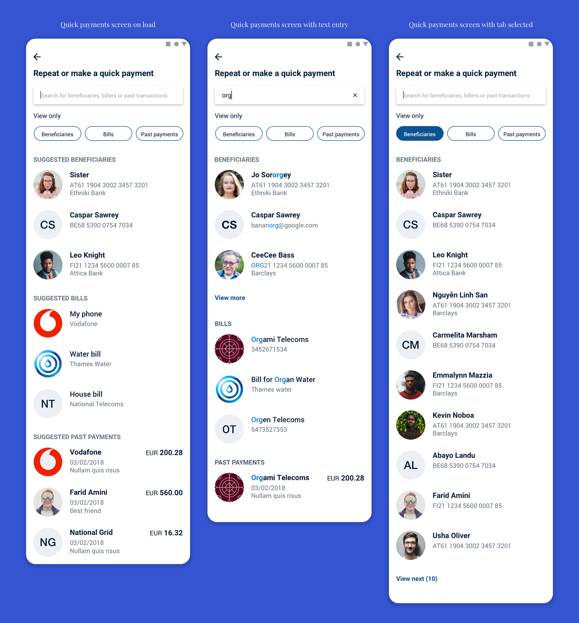
Quick payment search
As mentioned above there was a reasonable expectation that the majority of the users will eventually become part of the familiar-with-the-system group to allow them to use shortcuts for faster task completion, and for that reason, we introduced the quick payment search.
All content under search serves the same purpose: allow a user to perform a payment faster. By providing immediately identifiable tabs with familiar labels (beneficiaries/billers/ past payments) we allow users to further isolate content based on what they want to access.
All this, along with the ability to enter a term in the input field, allows the use of an intuitive system that promotes the “save-time” incentive once the functionality is discovered.
Beneficiaries
Following the logic that the ‘New transfer’ section is facilitating transaction-related actions, we created a manage section, accessible through a ‘Manage’ tab in the main transfer screen, which houses the list of saved beneficiaries and scheduled payments.
From this section, users can view the entire list of saved beneficiaries, save a new beneficiary (as an alternative path to saving new beneficiaries at the end of transactions), access beneficiary profiles that can hold multiple payment types (multiple accounts and PayIDs), and initiate new payments.

Pay form
There are 3 main, distinct sections to a transfer that requires different mental mapping:
-Who do I send money to (Beneficiary)
-Which account do I send money from (Payer)
-How much money do I send (Amount)
Out of the three, the beneficiary section is by far the most stressful to a user and prone to mistakes - mistakes which could potentially create major pain points - as users need to manually enter details they do not know by heart (these details have been given to them and most probably written somewhere). By isolating this task with the payment wizard, users can complete the rest information within a form, without any interference by other attention needing tasks, minimizing any room for error.

Usability testing
We used Proto.io to make the screens interactive, and the Usertesting.com platform to conduct an unmoderated remote user-testing with users from Australia, Canada, UK, and Europe. The demographics for picking up the testers via the platform were limited, but we were able to control the OS used and retrieve information related to educational level, age, and gender. We received the results with a video displaying the users performing the tasks, commenting along, sharing their thoughts, and explaining their blockers. We then examined, analyzed and used the data to iterate accordingly. Happily, the testing results were encouraging and only some small areas had to be revised, such as the micro-copy of the call-to-actions. We ran three test cycles, with the first one being using mid-fidelity wireframes and the rest two high-fidelity designs to create a real-feel condition combined with the fact that users used our app in their natural environment.
Script and tasks
Please read the following instructions out loud:
Remember to continue to speak your thoughts out loud as you interact with the test app. This is a prototype mobile app and not all the links or elements are working. Please let us know if there is anything that you do not understand or that may appear confusing to you. if you cannot find or understand certain aspects of the app please explain out loud clearly what you would expect to see or do to improve it.
Imagine that you are in the process of moving house after your landlord sold the flat you currently live in.
1. Send money to someone’s account
You found a new flat through McGrath Real Estates and to secure the property, the letting agent asked you to transfer a holding deposit of $3,000.00 to the following account: (omitted)
2. Pay bill
As part of finalizing your obligations before the move, you need to pay your last energy bill of $607.00 to Origin Energy Ltd.
3. Repeat a payment
Before moving out of your current flat, you also need to pay your last, outstanding rent of $2,300.00 to your landlady, Jane Whitington.
4. Pay saved payee
You have asked your regular house cleaner, Agatha Telon, to clean the new property before you move in, and now you need transfer to her account $450.00 for her fee and cleaning supplies.
Questions
Please state your sex, age and level of education.
How comfortable are you with using your phone for your personal banking needs (0=Not at all comfortable, and 10=Very comfortable)? Please elaborate if possible.
Do you usually use your phone or your pc for your personal banking needs?
The takeaway
Redesigning a legacy app was proven to be not an easy task, but this project was considered successful. It received positive comments from clients and the tests showed us that it will eventually have a positive impact on the payment experience. All it remains is for us to keep listening to what users need, and to never close this iteration cycle.